Website Redesign
Live UX improvements and a vision for ORANJEGROEP’s future website
Project Snapshot
At ORANJEGROEP, a Dutch recruitment company for blue-collar workers from Eastern and Southern Europe, I worked as the sole UX designer. My goal was to improve the outdated, difficult-to-navigate website—both through immediate fixes within a restrictive CMS and by designing a future-ready version in Figma for a WordPress rebuild. The aim was to create a more intuitive, mobile-friendly experience that supports job seekers and clients with clearer structure, trust, and accessibility.

The new design is expected to reduce bounce rate by up to 40%, improve credibility through testimonials and content clarity, and increase job application conversions with a streamlined contact and recruiter flow.

Problem
The existing website was cluttered, confusing, and not optimized for mobile - despite most users accessing it from their phones. The structure was unclear, the content poorly written, and there was no logical flow for users to follow. Recruiters struggled to direct users through the site, often resorting to WhatsApp for support. The rigid CMS made even basic changes difficult. In today’s digital landscape, a clean and user-friendly website is expected - especially for an international recruitment agency.
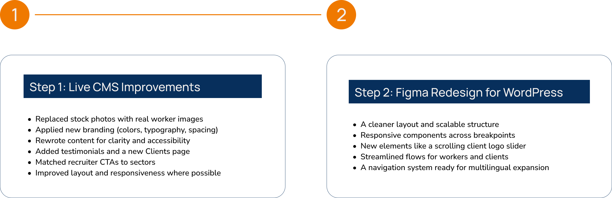
Two-Phase Approach: Live Fixes + Future Redesign
This project unfolded in two phases: first, I improved the live website within the limitations of the existing CMS, and then I designed a future-ready version in Figma for the upcoming WordPress rebuild.
Instead of waiting months for development, I applied essential UX and branding improvements directly to the live site - ensuring users experienced a clearer, more trustworthy interface right away.
Design Process
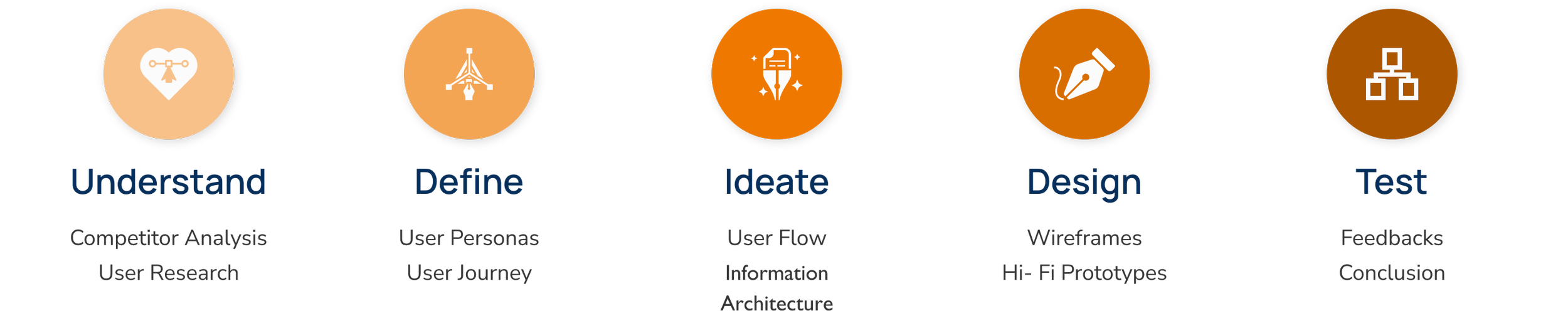


Competitor Analysis
Key Takeaways:
Multilingual Support: Most competitors offer websites in workers’ native languages (e.g., Romanian, Polish). Some lack English versions.
Job Listings: Filterable job sections are usually available on the homepage.
Clear CTAs: Prominent “Apply” buttons are common and easy to find.
User Experience: Layouts are generally intuitive, though some sites use low-quality visuals or feel overcrowded.
Social Media: Instagram reels with real workers perform best. Most competitors lack consistent posting or engagement.
Extra Value: Some offer practical info on housing, insurance, and life in the Netherlands—adding credibility.

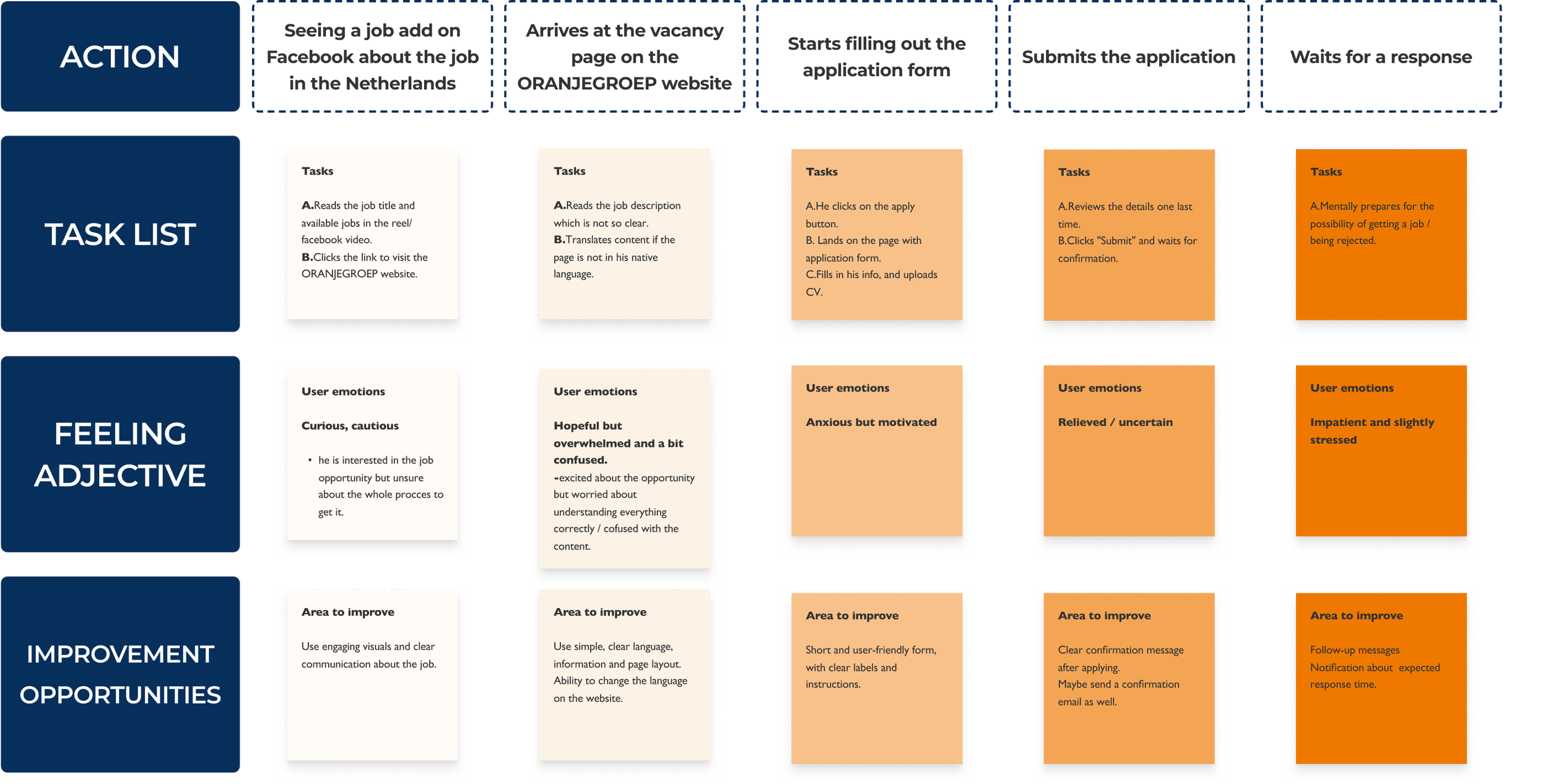
User Research & Insights
To understand our users, I combined direct communication with applicants via Facebook Messenger and WhatsApp with informal interviews with internal recruiters who interact with job seekers daily.

Salary and contract details are the top priority - users want this info upfront
Navigation is a barrier, especially on mobile
Low English proficiency leads to skipped or skimmed text
Users prefer visual content, short copy, and clear CTAs
FROM REAL CONVERSATION
Users ask the same core questions: pay, location, housing, transportation, contract type
Many drop off during application due to unclear steps
Recruiters often have to manually fill UX gaps via WhatsApp or calls
FROM RECRUITER INTERVIEW

User Persona
User Journey Map
Information Architecture
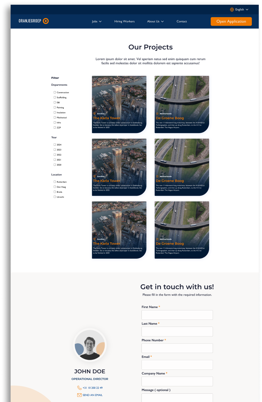
Results & Impact (Phase 1: Live CMS Redesign)
Following the redesign of ORANJEGROEP’s existing website, I conducted a UX performance analysis comparing user behaviour from May - July 2024 (pre-redesign) to May - July 2025 (post-redesign).
The goal was to improve usability, streamline job exploration, and make key actions - such as applying or contacting recruiters - more intuitive.
Key Outcomes:
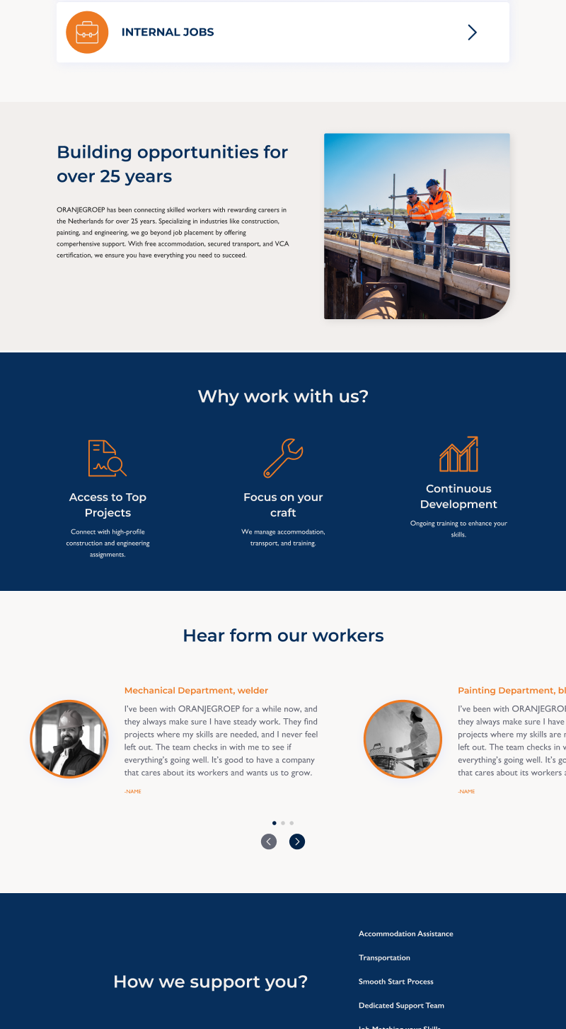
New Clients page introduced - the redesigned site included a dedicated /clients page, averaging 32s of engagement. This gave business visitors a clear and trustworthy destination, improving B2B communication.
Increased engagement time on vacancies and contact pages - users found the updated layout and content more relevant and useful.
More efficient navigation - while average engagement time per user dropped overall, this was due to clearer navigation and better information hierarchy, allowing users to find what they need faster instead of getting lost.
Improved application flow - clearer CTAs, simplified steps, and better-structured pages reduced friction in the job-seeking process.
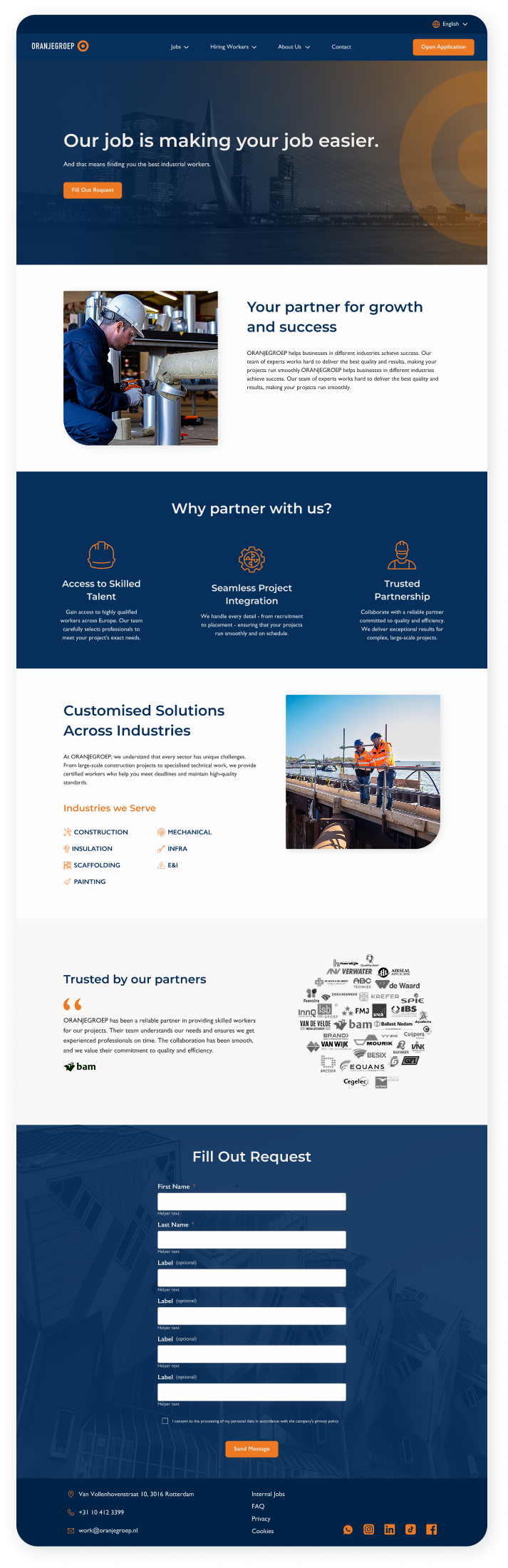
Predicted Impact (Phase 2: Figma Redesign)
0.05 seconds to make a first impression
With a simplified homepage layout, stronger visual hierarchy, and clean branding, the redesign is expected to reduce bounce rate by 30 - 40% and make the brand more approachable and trustworthy.
Users form an opinion of a website in under 50 milliseconds, and poor design leads to instant doubt - especially for international workers facing major life transitions.
48% increase in perceived credibility
By adding partner and visually improving worker testimonials, adding clients logos, a dedicated Clients page, and rewriting the copy to be clearer and more direct, the new site is expected to significantly improve user trust and professionalism perception.
Nearly half of users judge a company’s credibility based on website design alone. The original site lacked testimonials, real user quotes, and clear structure.
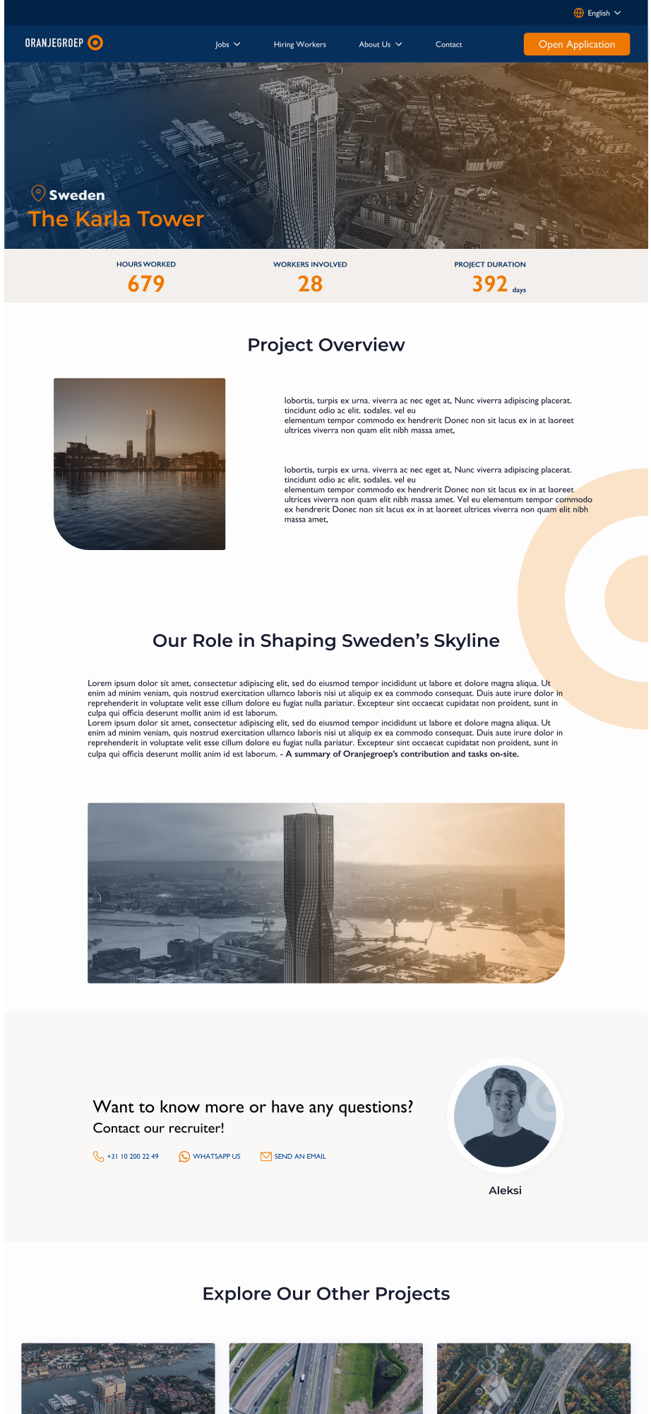
CLIENTS PAGE:
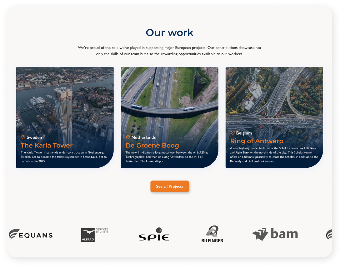
PROJECTS + CLIENTS LOGOS:
4x times higher conversion potential
Research shows that UX improvements can boost conversion rates by up to 400%.
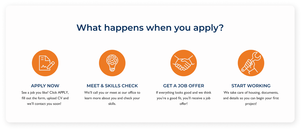
By redesigning the application steps with illustrations, adding an “Open Application” entry point, improving vacancy cards, fixing recruiter links, and introducing a Thank You page, the new site is expected to streamline the application flow and reduce drop-offs by 20 - 30%.
94% of first impressions are design - related
Poor layout choices were hiding important content and reducing trust.
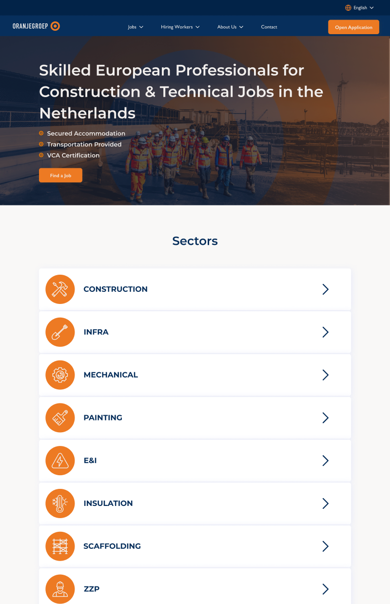
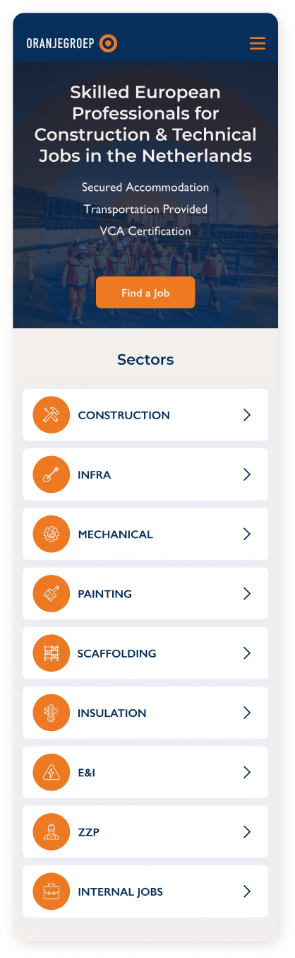
I redesigned the job sector section into a vertical grid, giving equal visibility to all sectors, improving discoverability, and reducing friction - especially on mobile, where accidental swipes and missed content are common.
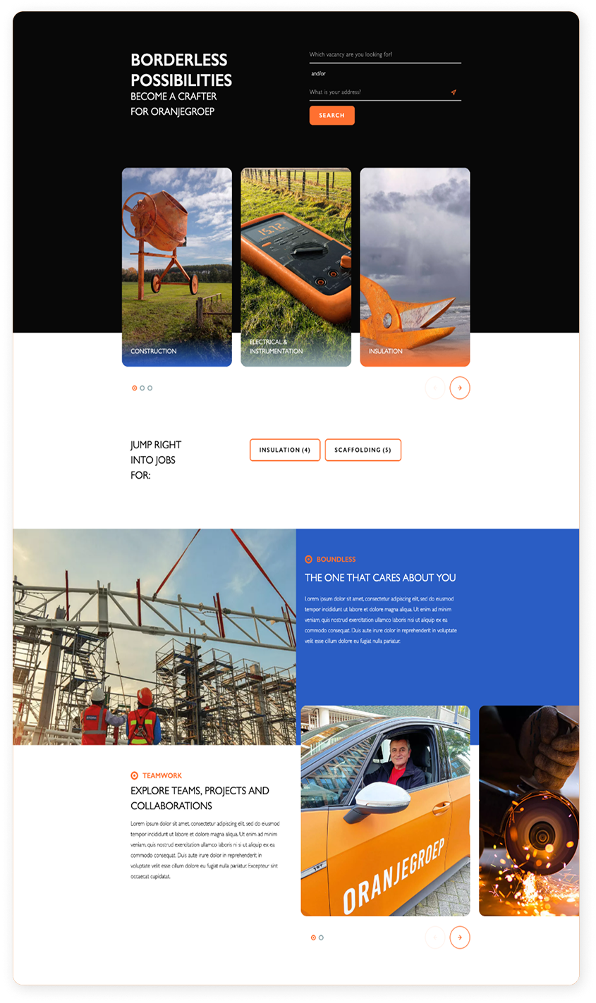
BEFORE:

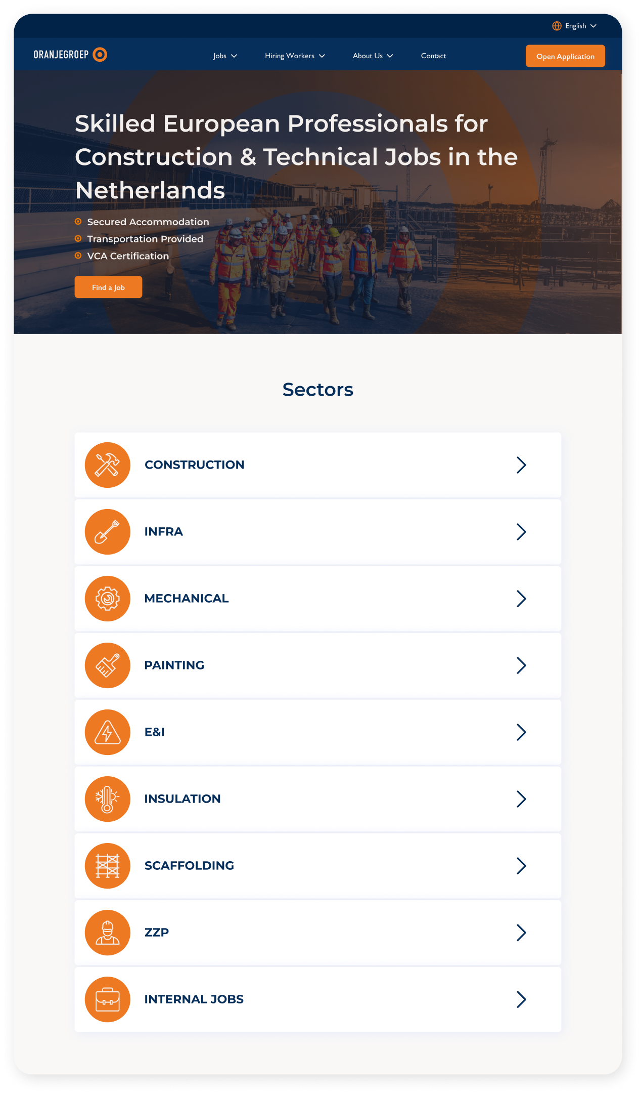
AFTER:
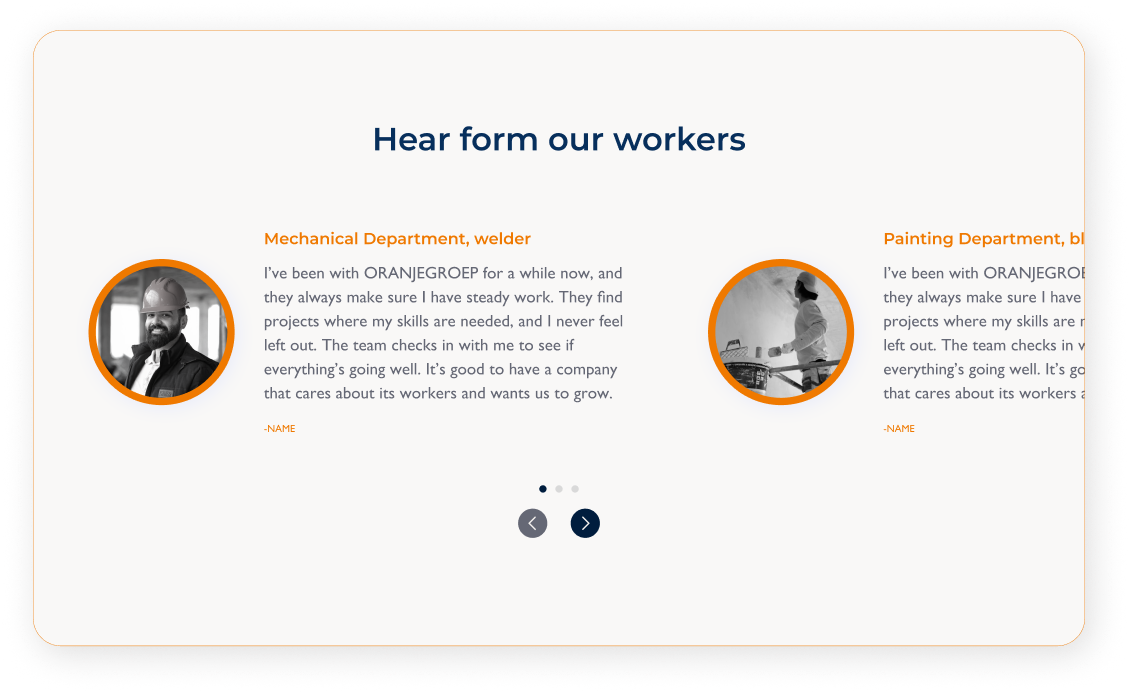
I also redesigned the testimonial slider with a cleaner layout and simpler navigation, making feedback from workers and partners easier to scan and more visually engaging to quickly build trust.

Emotional reassurance = 2x more likely to convert
When users feel supported, they’re more likely to act.
Through redesigned testimonials, a clear “How we support you” section, supportive copy, recruiter visibility, the new site builds trust and reassurance essential for workers relocating abroad.

Fully scalable: ready for 100% multilingual rollout
The current design structure is built with future growth in mind.
While the live site is still in English only, the new layout, content system, and navigation have been prepared for smooth multilingual integration - ensuring scalability for all target user regions.
UI Enhancements
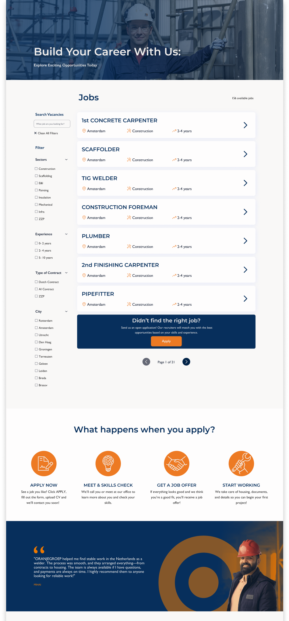
JOBS PAGE BEFORE & AFTER:


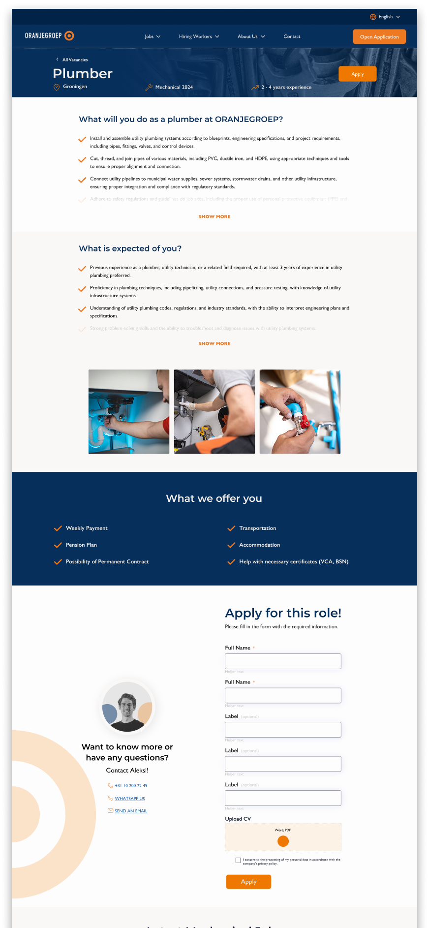
JOB DETAIL PAGE BEFORE & AFTER


Styleguide
The redesign follows ORANJEGROEP’s updated brand identity, created by designer Felix Silvagni. She developed the color palette, illustrations, and custom icon set that give the site its distinct look.


Montserrat for headings (clear, modern, bold)
Gill Sans for body text (clean, highly readable)
For typography, we use:
My Role
My role was to translate the new brand identity into a functional and intuitive digital experience. While the visual system: color palette, typography, illustrations, and icons - was created by our brand designer, I was responsible for implementing it consistently across the website. This included designing layouts that respected visual hierarchy, ensuring spacing and interaction patterns supported usability, and aligning every UI detail with both the brand's personality and the needs of our users. The result is a user experience that not only looks cohesive and trustworthy, but also feels simple, human, and aligned with the expectations of international job seekers.